In 2014 flat web design websites are all the rage and the big brands have certainly adapted.
One of the biggest brands of them all, Microsoft, has been a catalyst in increasing use of flat web design among large corporate websites. More specifically, the Windows 8 operating system has meant a huge boon for this design trend with is sleek minimalist flat panel-based interface.
The reduction in the use of shadowed effects and heavy graphics now means corporate retailers can focus the eyes of their audience on what really matters: high-resolution images of their products. The hope is that in turn they can accomplish more sales and a higher click-through rate to key areas of their websites.
Flat designs are also perfect for mobile-responsive versions of websites because a single color can be used to create a panel or effect instead of using an image of static dimension. This makes large, heavily trafficked websites more light-weight and will decrease website load times.
Here are our picks of 10 Big Brand websites who are knocking the flat web design concept out of the park….
1. Microsoft
Clean and sleek, Microsoft supercharged the trend of big brands using flat design with their Windows 8 Operating system.
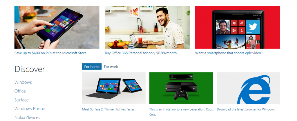
High resolution images become essential when doing a web design for a minimal flat look.
Minimal flat web design for such a large corporate retailer can be a risky proposition. There is a fine line in flat web designing between a website that looks too plain and one that absolutely stuns. Microsoft.com is a great example of using high-resolution photos to bring attention to your products while leaving the rest of your website minimal.
2. Sony
Another large product retailer, the sony website showcases some awesome high-resolution product images that makes the user want to buy buy buy. This website is however, not strictly a flat design but the color gradients used are so subtle that menus and header panels look basically flat. We’ve always felt that its better to have very subtle gradients when doing web and graphic design (where the start and end hex colors are very close to each other and are in the same alpha hue).
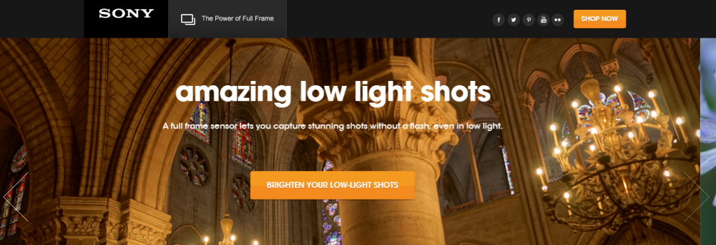
Large call to action text is also showcased on Sony’s website. Once again this is a key feature of many successful retail websites where you want to waste as little of your website’s visitor’s time as possible. Once again the emphasis with flat design is not on your web designer’s nifty tricks in Photoshop but rather on high-resolution product shots and kick ass CSS effects that only further highlight products.
3. KFC
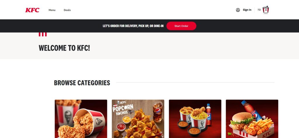
4-5 years ago Kentucky Fried Chicken (KFC) launched a massive re-branding campaign for all its 18,875 physical franchise locations across 118 countries. The updated look included more modern looking store-fronts with wood and chrome finishes and large high-resolution poster-style image & text murals wrapping their buildings. KFC has extended its redesign concept to its website and has employed some additional tricks to really highlight products and call to action statements. www.KFC.com
4. Chevrolet
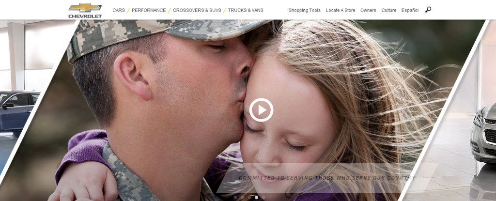
Chevrolet.com mixes things up in a good way, showing that flat design doesn’t have to be perfectly square or rectangular. Ultra crisp images in this flat but angular design demonstrate another feature that flat web design allows: focusing attention on imagery to create an emotional connection. While selling cars is important for auto retailers, it’s also key to stir a sense of emotion in potential buyers.
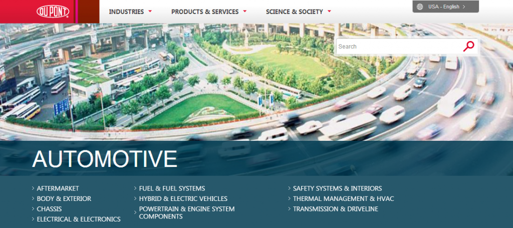
5. Dupont
Dupont manufactures and distributes of a wide range of products in the U.S. Dupont’s Coporate Website has clean flat panels and awesome imagery. Definitely a corporate website worth checking out.
6. Grace Foods
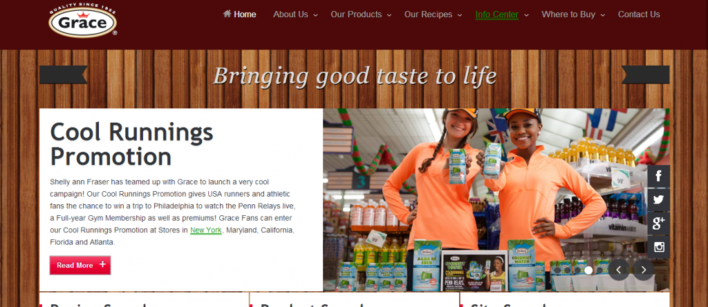
This attractive Jamaican website design features awesome flat panels with rich images of food products and great Caribbean recipes. Check out Grace Foods.
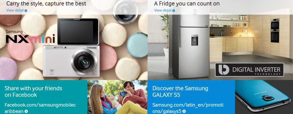
7. Samsung
Simple flat designed website with semi-transparent panel and awesome CSS3 and JQuery transition effect. Super high-resolution images perfectly focus attention on their electronics products. www.samsung.com
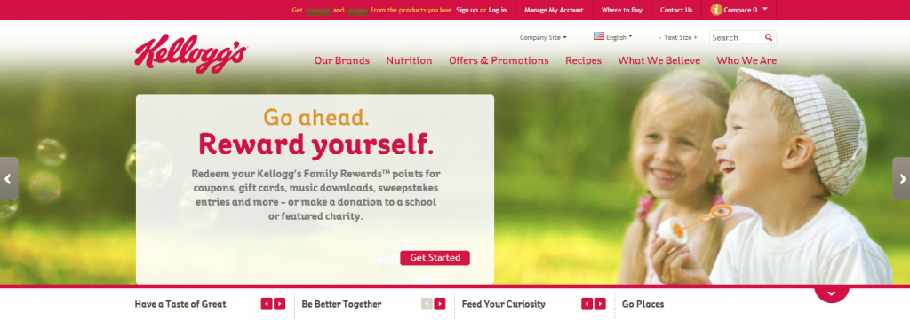
8. Kelloggs
Another food manufacturing and distribution giant. Check out the Kelloggs website for some clean flat web design and some interesting use of colors.
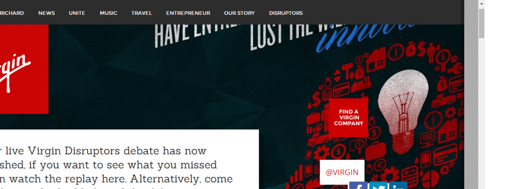
09. Virgin
Virgin.com further proves that flat web design doesn’t have to be boring. It also doesn’t have to be minimal. This website features a semi-grunge style layout with cool fonts and images kinda similar to what you’d see inside a TGI Fridays restaurant. Very cool.
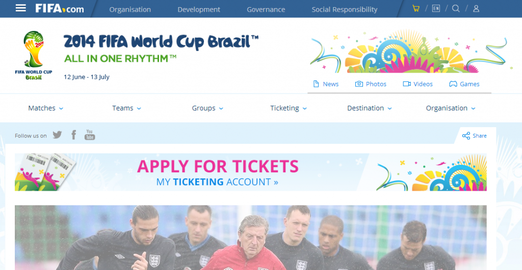
10. Fifa World Cup
Fifa World Cup’s official website has gotten its biennial redesign and everything has gone FLAT….in a good way. Check out its clean minimalist design www.fifa.com